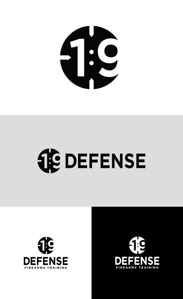

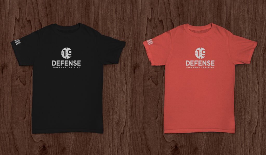
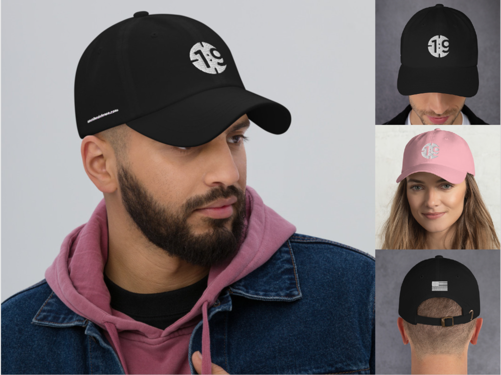
The goal for the company’s branding was to be easily identifiable & referred to as 1:9 in the “firearms community.” Approachable but not too “tactical” nor intimidating, this logo represents courage and strength in Joshua 1:9.

1:9 is off-centered to give it the appearance of looking through a scope. It teases the viewer with the illusion of motion as one attempts to center onto the 1:9. Negative space of the “9” fills in the circle nicely. Simple, smooth, and slick.
The challenge was to make 1:9 look centered inside a circle as I experimented with it. So I stopped wrestling with that, let it be off-centered, and came up with this. When Jon Williams – owner & lead instructor – first saw it, he said:
“You nailed it… I thought “that looks like you’re looking in a scope”. That look is called “eye relief”, when the shooter is trying to get the image in focus and steady. I knew you were a gun guy deep down, Drew.”


